

txSync website redesign
Branding, Website


Studio Direction est. 2019
THINGS THAT YOU ARE NOT PROUD OF SHOULDN'T BE SIGNED BY YOUR NAME.


(ABOUT PROJECT)
txSync is a team of experienced builders who deliver tools for managing digital assets across ZKsync networks. Their all-in-one platform for using and building on ZKsync is an umbrella for several different products that needed to be redesigned.
Visit website(services)

Having previously collaborated on multiple branding and marketing projects, our team had gained deep insights into txSync’s business and market impact. We understood very well where from does the need for the brand refresh comes from.
Key deliverables
- Brand redesign: color scheme, custom brand device
- Marketing collaterals: print and digital
- Website redesign
Brand redesign
Two years after launching the txSync brand, it was time for a refresh. Backed by internal and external feedback, the team kicked off a focused creative process to redefine the brand’s visual identity. We explored updated brand elements and design devices that better reflect txSync’s growth and broader context since its original launch in 2023.
Marketing collaterals
The brand uplift needed to be reflected consistently across all digital and print touchpoints, including social media profiles, posts, merchandise, email signatures, and more. Thanks to Figma Buzz, our team was able to deliver a comprehensive, near error-proof package that can be easily used by team members with varying levels of design experience.
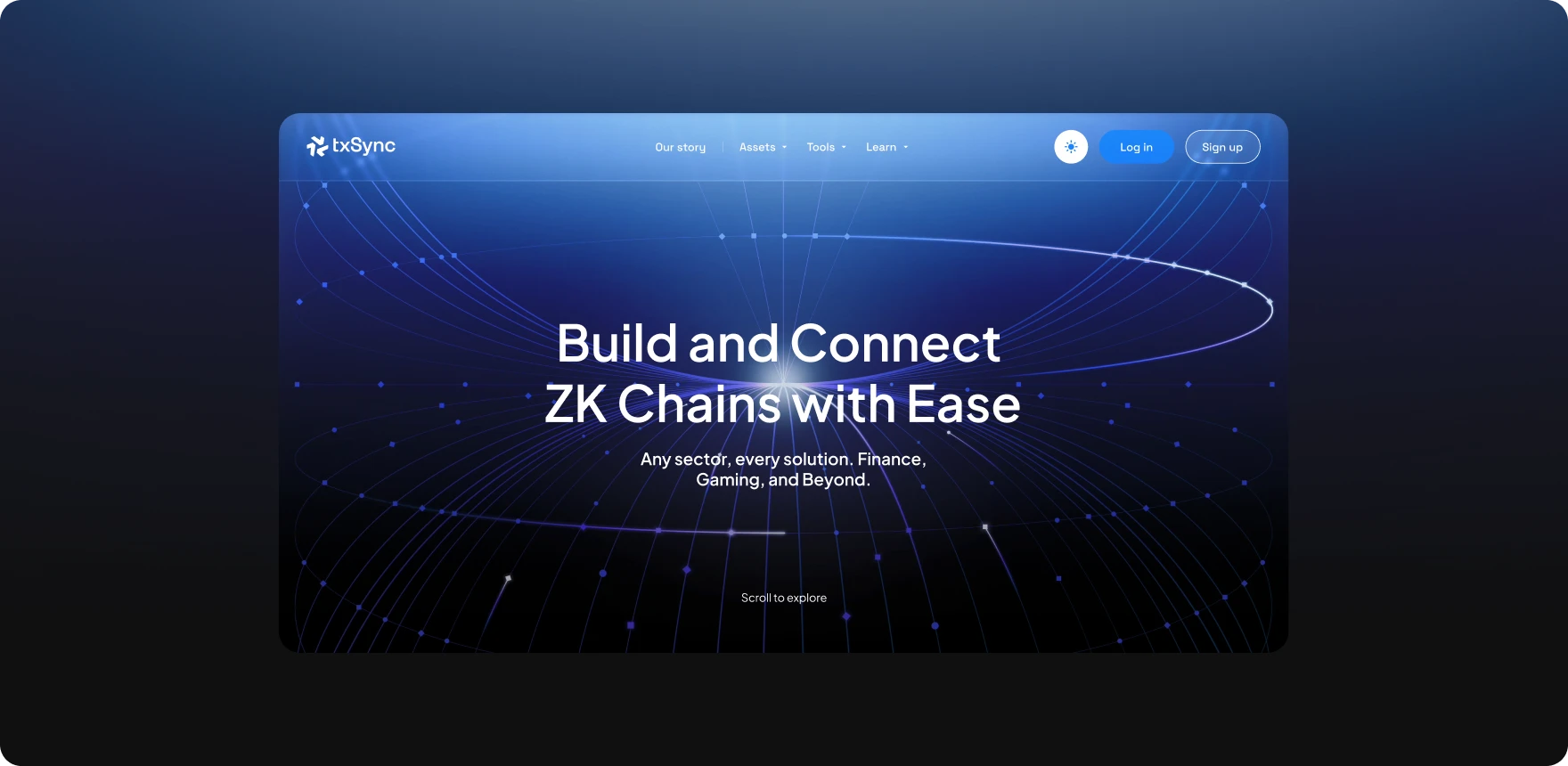
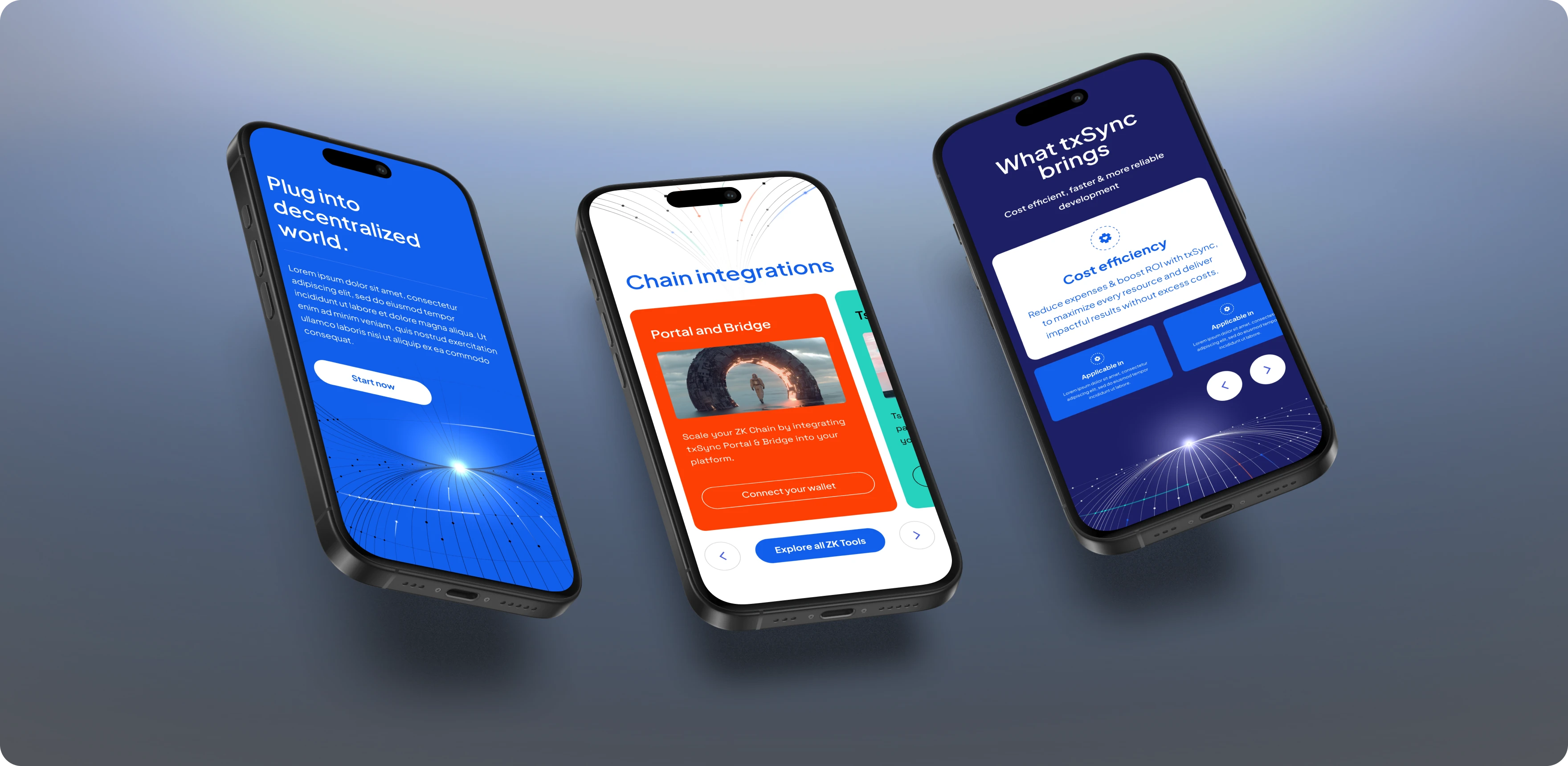
Website redesign
The new txSync website needed to reflect the platform’s growth: both in terms of the products and services it now offers. Originally a simple presentational site, the updated version is content-rich, offering more in-depth information about the products in development, as well as insights into the team, their skills, and capabilities.
With a larger number of pages, one of the main challenges was ensuring intuitive navigation and clear user journeys. Our focus was on organizing the structure in a way that feels natural and easy to use, while still showcasing all the key content that needed to be featured.
The expanded site also gave us room to explore and apply the refreshed brand system - including the new brand device, updated color palette, animations, and micro-interactions. We tested how the new visual elements performed across different backgrounds, including dark and vibrant color schemes, and used them intentionally to enhance both readability and engagement. Collaborating closely with txSync’s front-end developers, we had fun bringing these ideas to life - and we’re excited to share the result with the world.


(GET STARTED)
We are eager to build a cohesive digital world for your ideas. Drop your details below and watch your vision takes shape.