Pathway - Web application for Property Search


written by
Bojan Borjanic
In this article we're braking down the UX for the property search in the context of the Pathway project.
The goal of the web application is to introduce a truly innovative concept and educate the user to use existing knowledge about digital products, play around and explore their options by providing and changing their inputs to find the desired property.
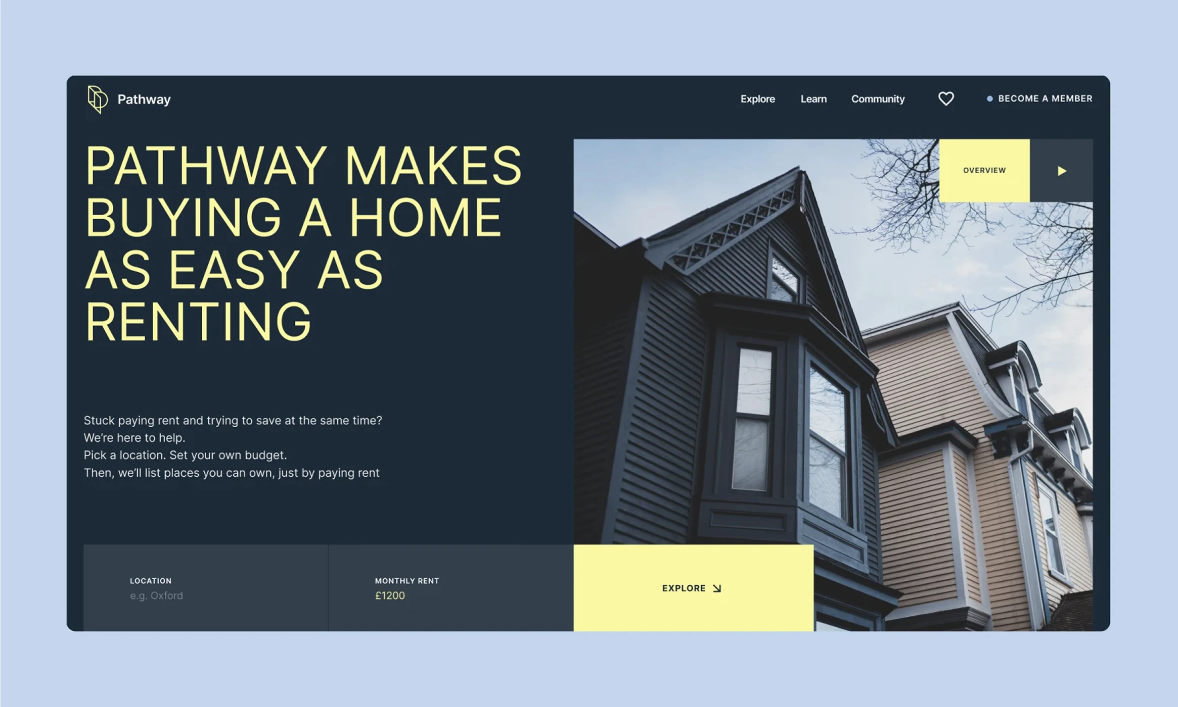
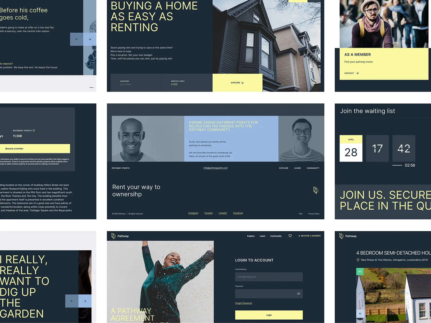
User journey starts from the website where search functionality is emphasised in the hero section on the website. Animations are discreet so they don’t distract from the key messages and functionalities.
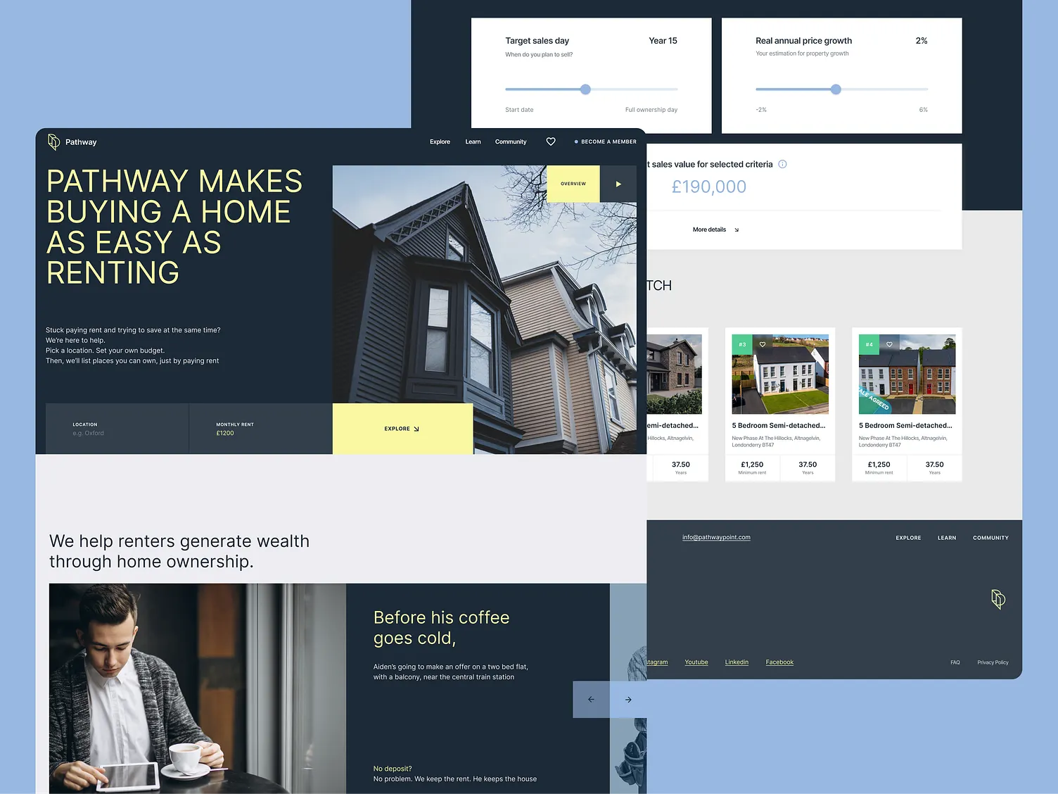
Main idea of the project “Show homes not loans” was a guiding star for decisions made in terms of the visuals and communication. Secondary colour is used to drive user’s the attention and emphasise key actions they can take. This was a way to guide the user through the concept, terminology and ideas that are new on the market and educate users along the way.
Powerful data engine in the background covers whole UK’s property market and serves actual properties that are available for sale with no need to explore several different websites and visit numerous bank consultants. When a user learns to analyse results and options given for their inputs, they’ll start creating their own plans by evaluating their personal and family preferences: neighbourhood, number of bedrooms, distance from work, main city areas etc.
Since Pathway concept considers highly personalised offering, user journey was designed to inform them and encourage them to play around with numbers, sliders and the interactive map. Main challenge was to educate the user, explain what will be the result of their actions and how to analyse them. Another challenge was to provide enough information and yet not to overwhelm them when introducing new concepts that can’t be googled. Accordions were super useful here: key piece of the information is shown and rest of it is “hidden” at the first glance.
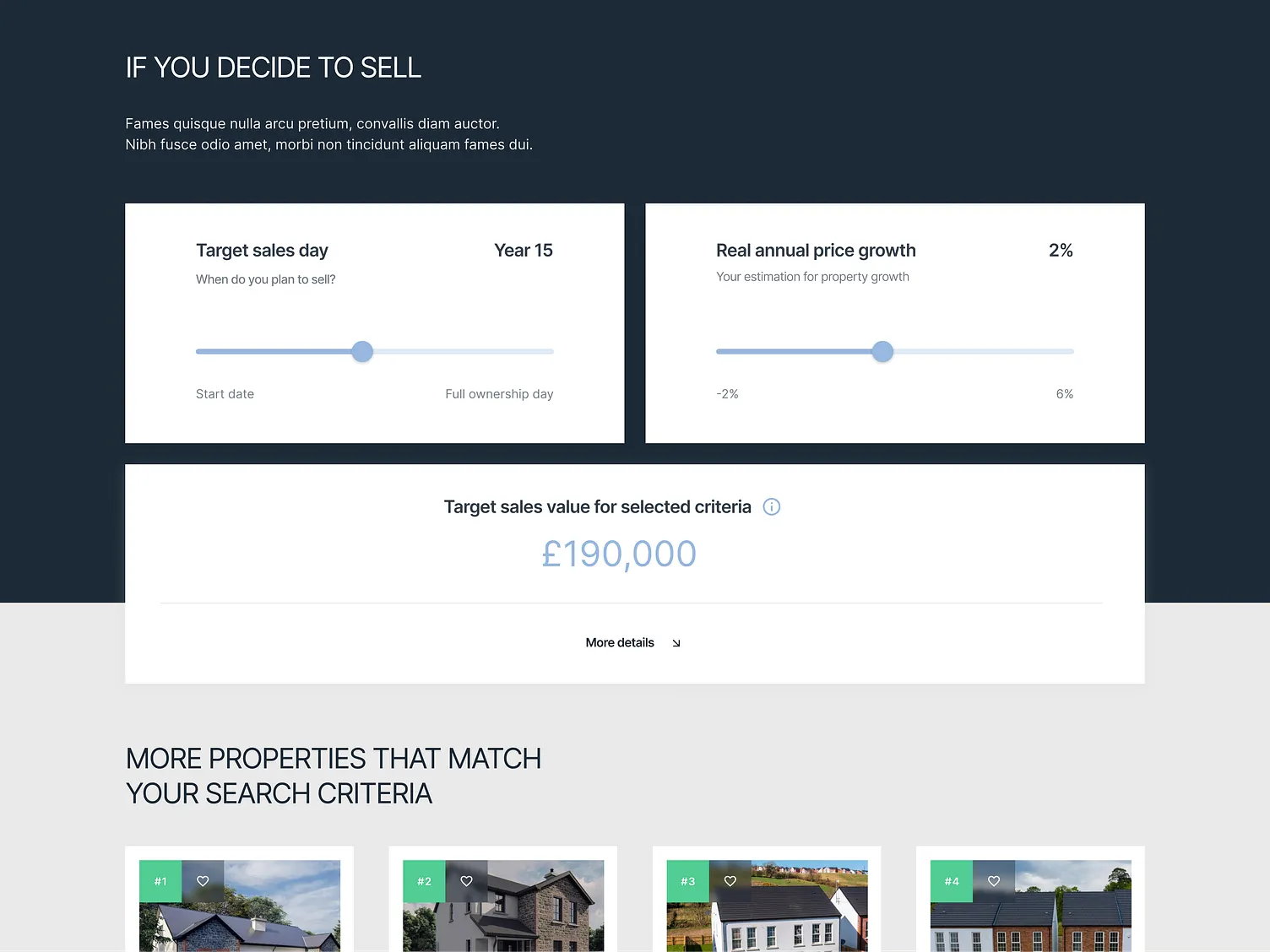
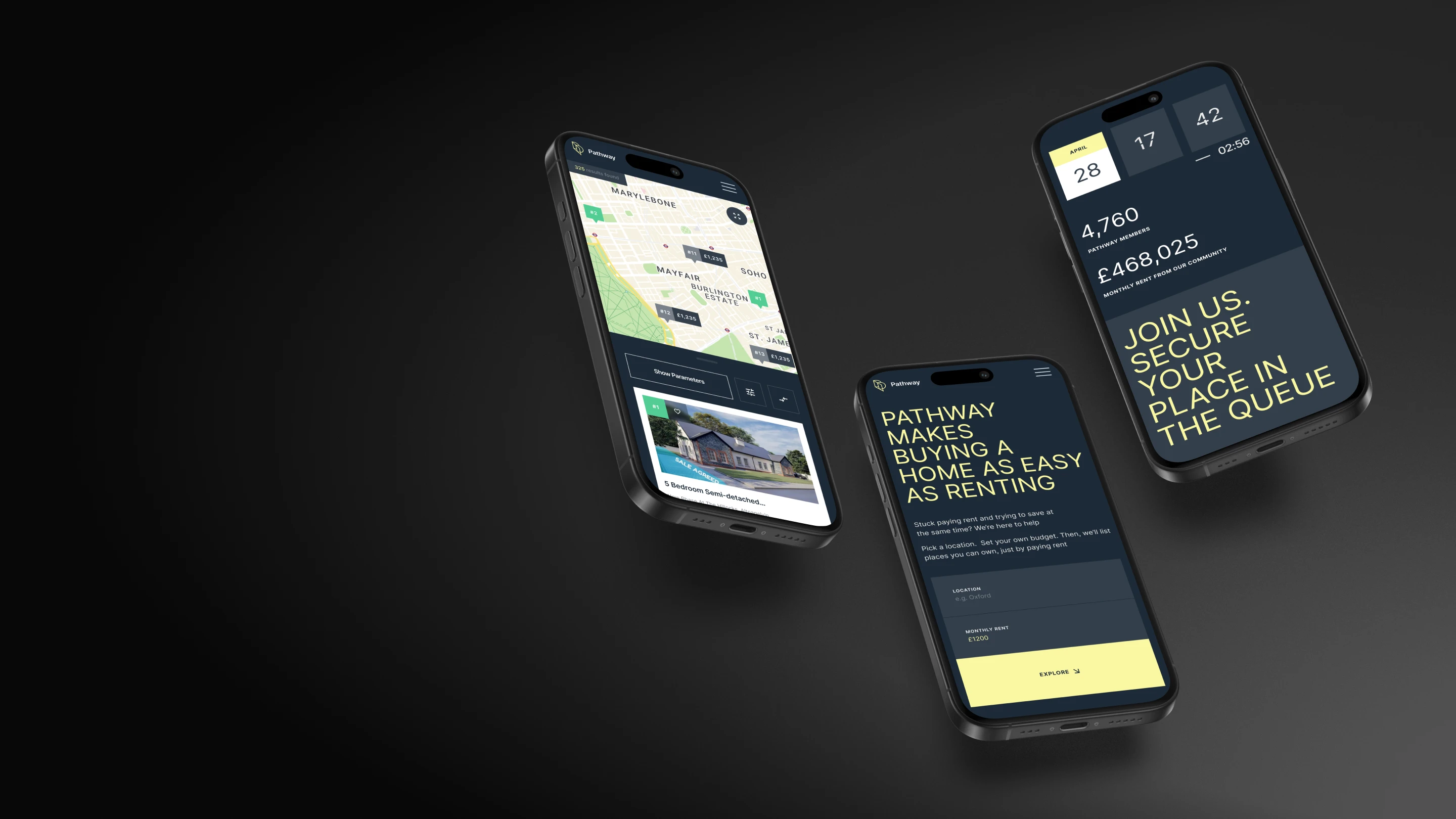
Showing properties on the map seemed obvious: the list on the left side might be overwhelming due to the number of results but seeing pins on the map makes it easier for the user to absorb the info and continue exploring and navigating on the map by zooming in and out.
When they’ve found the property they like, they can continue exploring. Now we come to the point where good UX provides information for decision making. User is able to interact with the product by changing inputs for the monthly rent and deposit and observe how the Full ownership date (as main output) will change. This is a way to explore in real time how smaller amount of rent would affect the date when they become property owners: they might choose to pay lower rent for a longer period of time and invest in home maintenance.
On the other hand, if they would like to invest higher deposit and become property owners earlier, system informs about the minimum amount of rent they need to pay i.e. when is the earliest moment property can be in their ownership. Interface is simple and yet informative: hover state, validation on input fields and info boxes lead the user through the decision making process.
Related project
(GET STARTED)
We are eager to build a cohesive digital world for your ideas. Drop your details below and watch your vision takes shape.


