Centili website
Website


Studio Direction est. 2019
THINGS THAT YOU ARE NOT PROUD OF SHOULDN'T BE SIGNED BY YOUR NAME.


(ABOUT PROJECT)
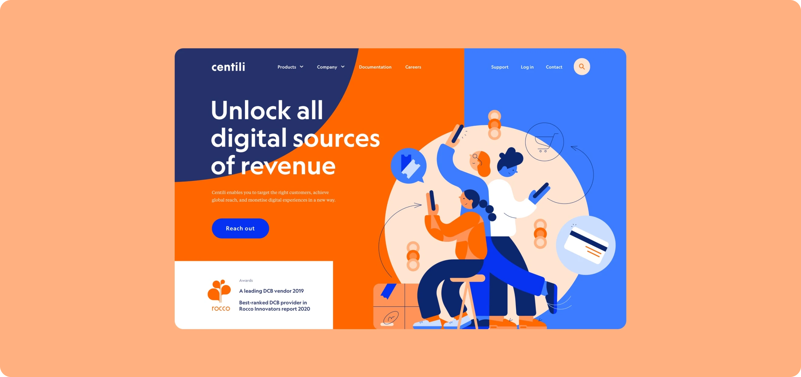
Centili partners with over 280 mobile network operators, and leading digital content providers. User-friendly platforms for mobile payments management and customer care is what they bring to the table.
Visit website(services)

The challenge
Studio Direction was tasked with designing the experience for new official Centili website. In the course of Centili’s tenth anniversary a major rebranding effort happened. Studio Metaklinika did an amazing job with a new identity and our job was to put it in one seamless experience.
Key deliverables
- Branding implementation and motion design
- Web design
- Custom web development
Branding implementation and motion design
Each element of the design was planned with careful attention to detail, ensuring a UX experience that exceeds expectations. To ensure holistic approach from the very beginning, our team conducted a series of online meetings with Centili to develop a solid, creative, and flexible plan for the implementation on the website.
Web design
We worked hard to figure out the anatomy behind the Centili products and started with an in-depth analysis of the Centili platform and what it brings to the table.
A sleek and modern dashboard design characterized by a clean layout, intuitive navigation, and purposeful use of color to enhance data comprehension. Key features include a well-organized sidebar, strategically placed cards, and interactive elements that prioritize user experience and facilitate quick decision-making.
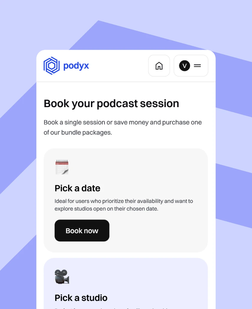
Mobile UX design presents a unique set of challenges, including the growing variety of devices, diverse interaction patterns, and the need for consistent, seamless experiences across all platforms. With Centili’s strong focus on its users, the project required careful consideration to deliver the level of user experience clients expect. When it comes to UI, attention to detail and precision are paramount.


(GET STARTED)
We are eager to build a cohesive digital world for your ideas. Drop your details below and watch your vision takes shape.


